UI/UX
AGENCY COLLABORATION
YEAR: 2025
ROLE: UX/UI Designer · Research · Visual Design
PLATFORM: Mobile Application
TOOLS: Figma, Miro
COLLABORATION: Thoughtfull Studio (Design Agency)
PROBLEM
{1}
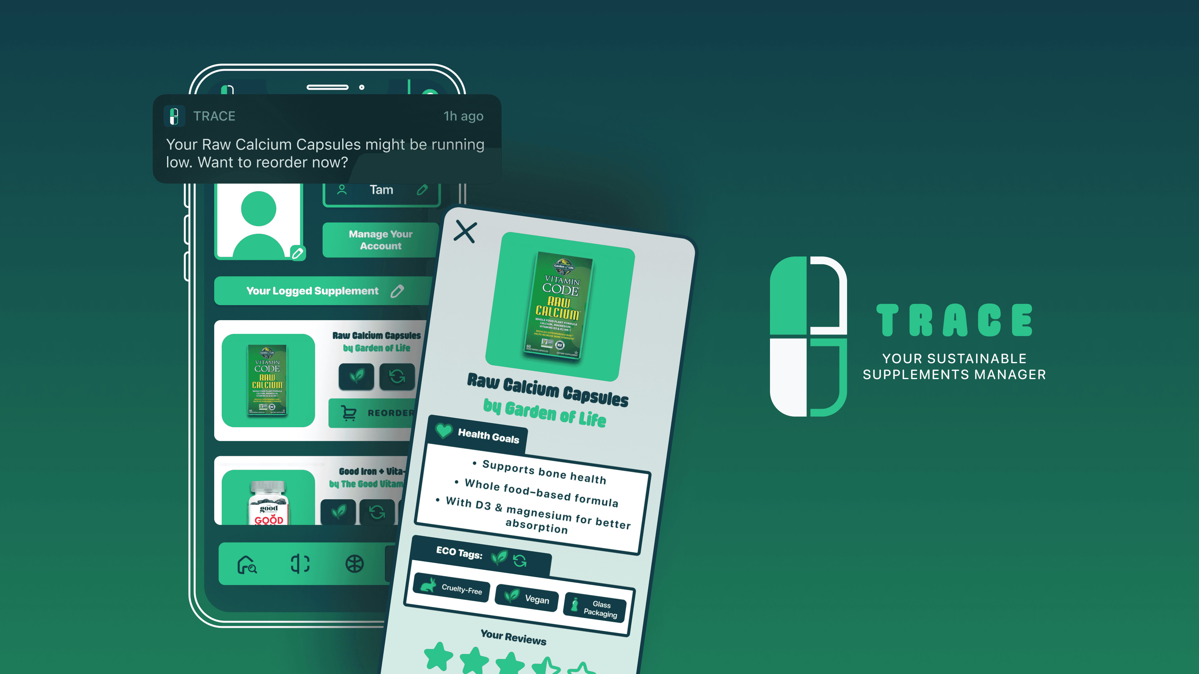
For eco-conscious consumers, it’s difficult to determine which supplements are genuinely sustainable, ethically sourced, and worth trusting.
This sparked the question - How can we help environmentally conscious users find, manage, and reorder supplements that align with their sustainability values?
SOLUTION
{2}
Helping eco-conscious users discover, verify, and maintain sustainable supplement choices.
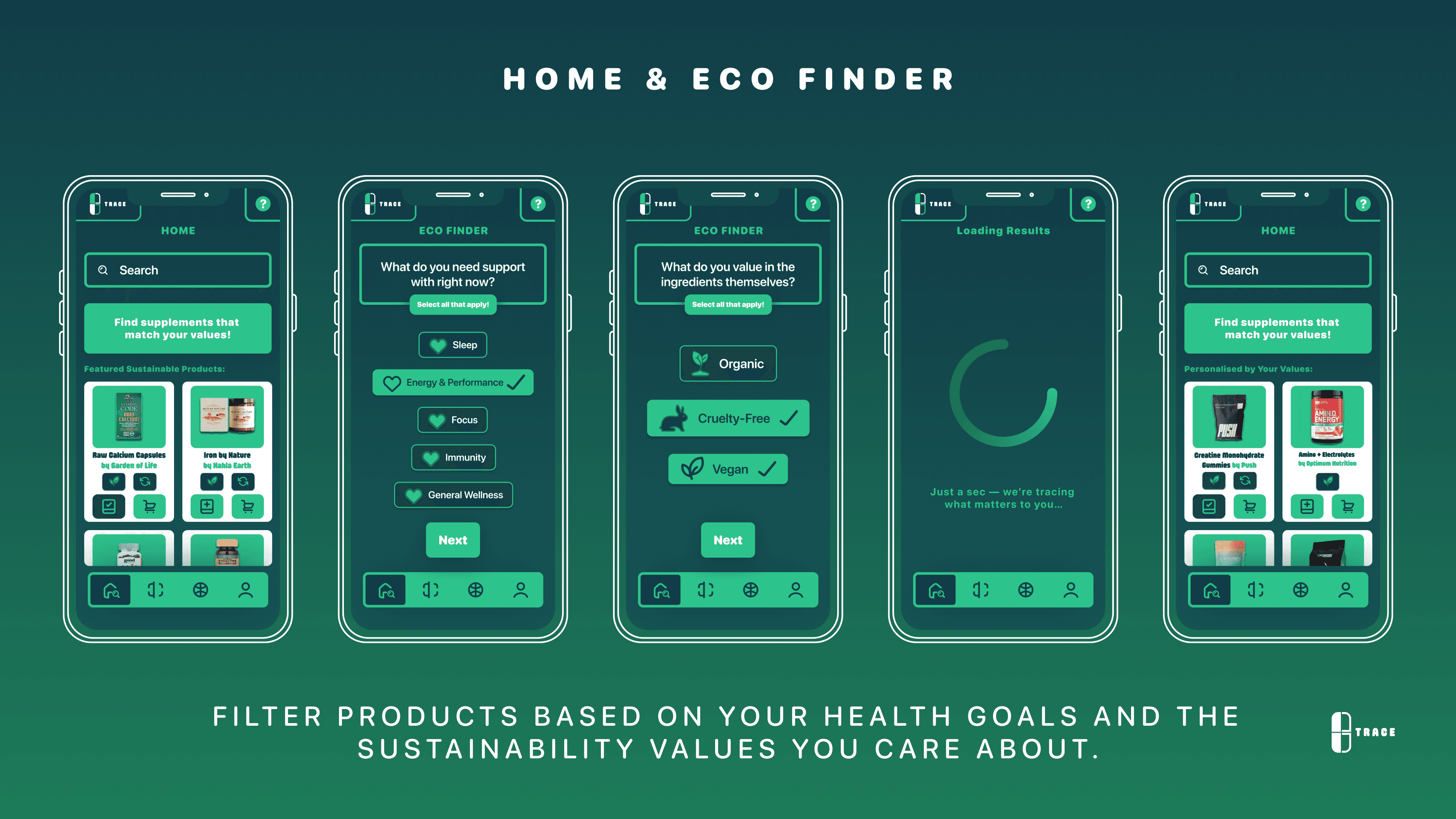
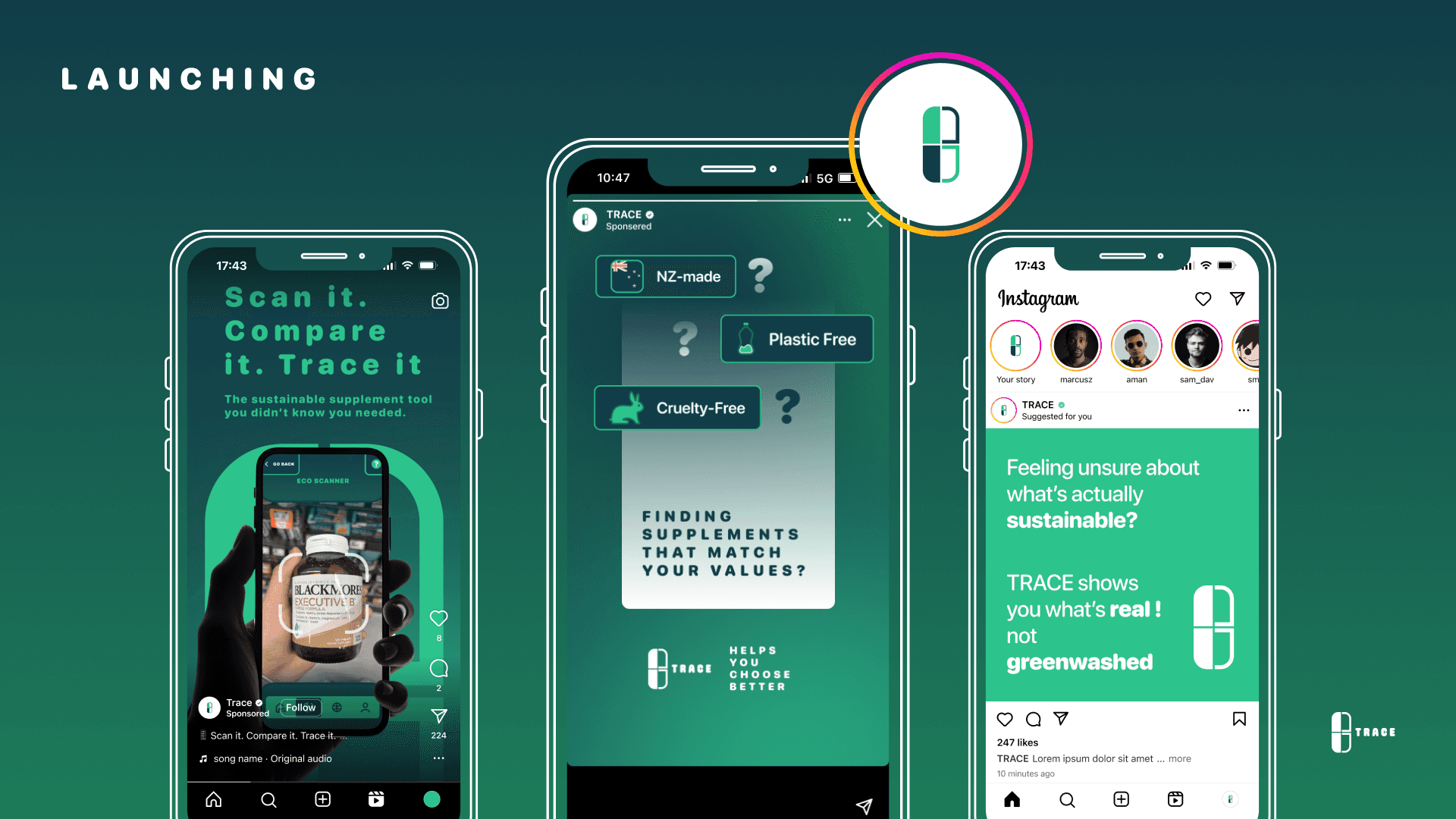
Centralised marketplace for discovering sustainable supplements across brands
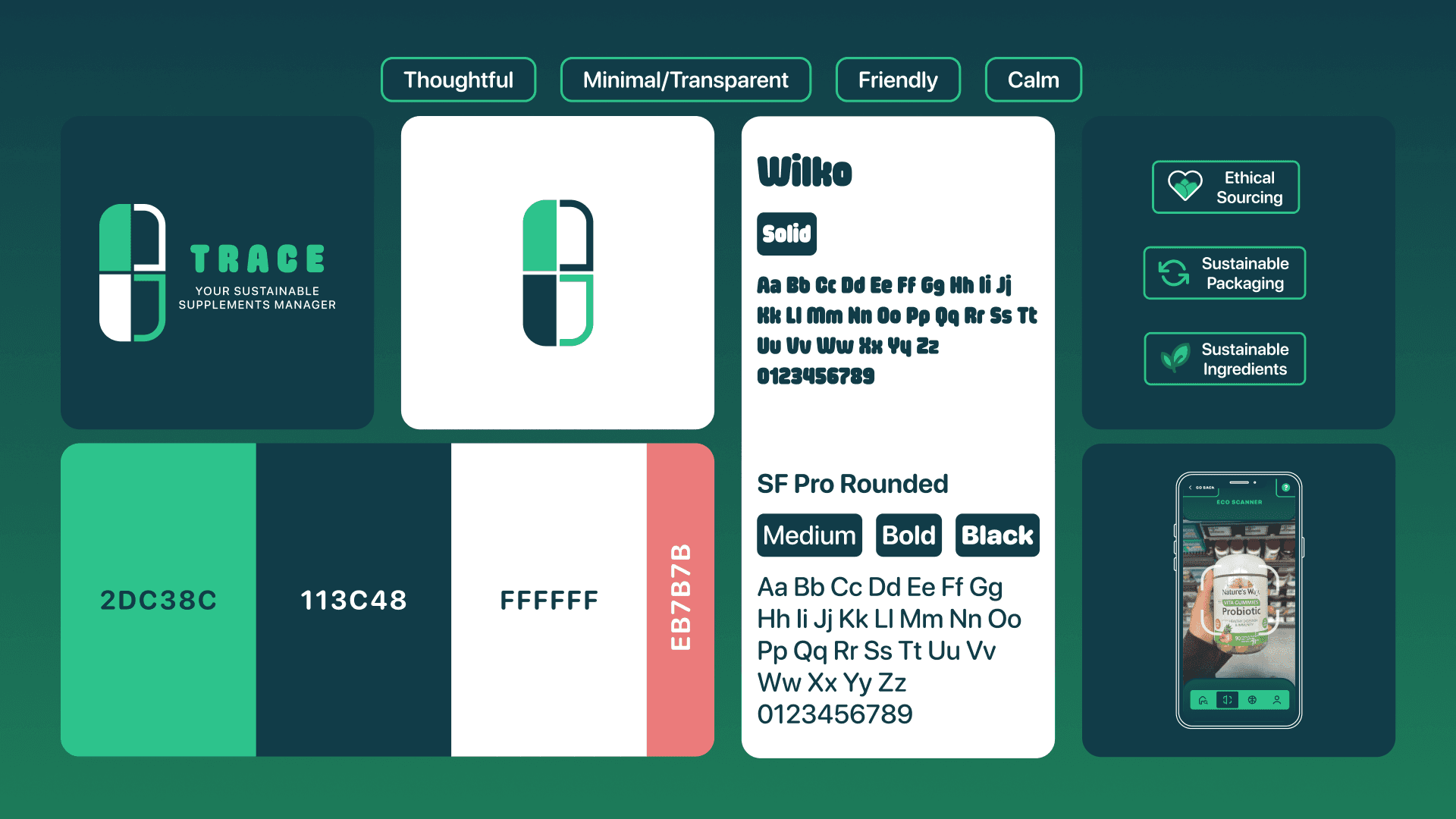
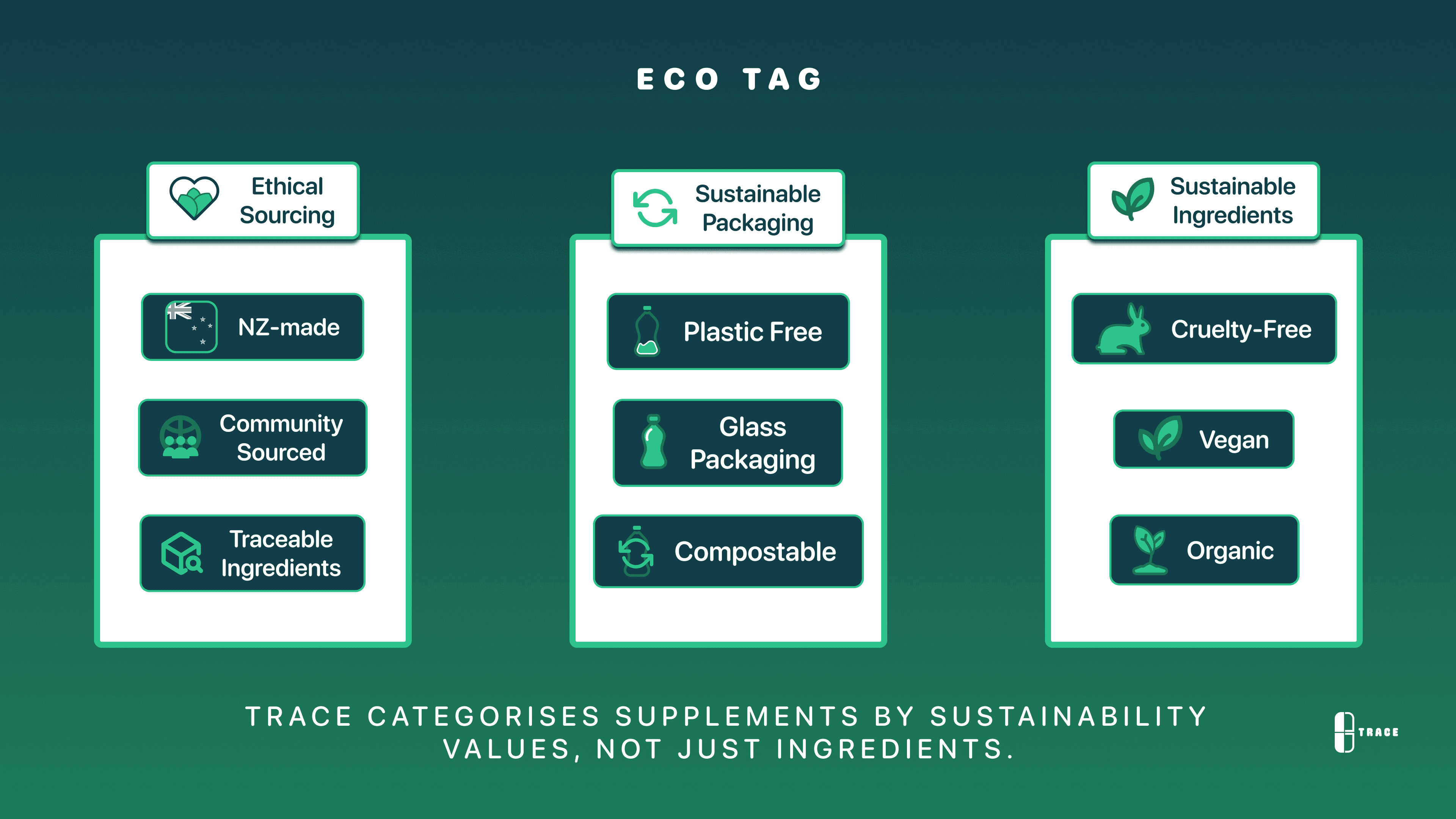
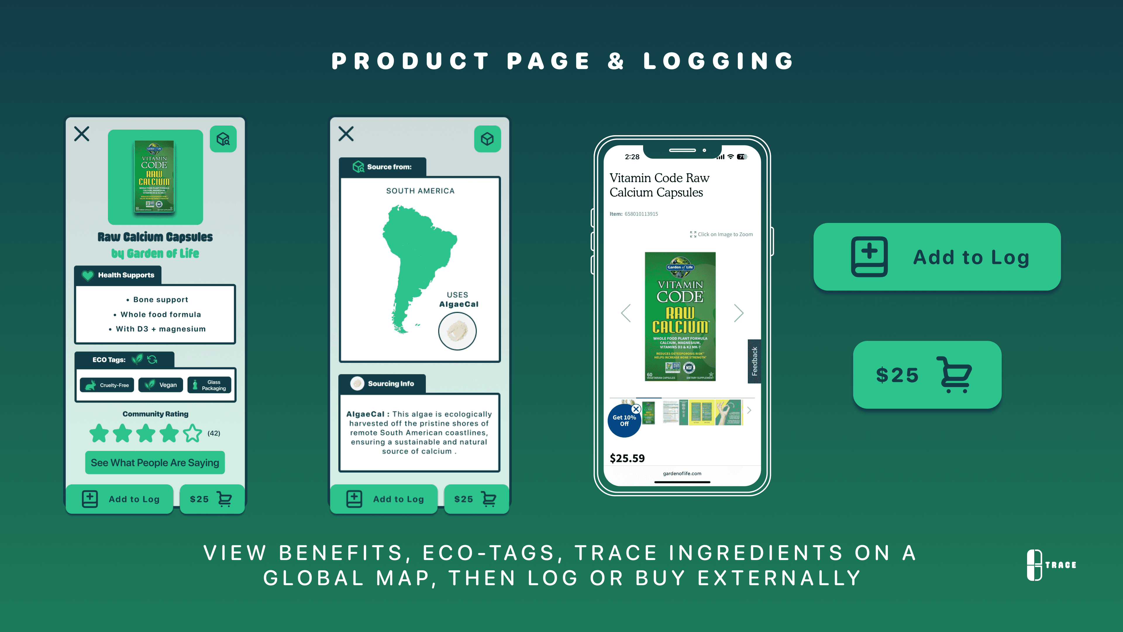
“EcoTag” design system for quick comparison based on ethical sourcing, packaging, and ingredients
Filters from personal sustainability values, reducing decision fatigue and greenwashing ambiguity


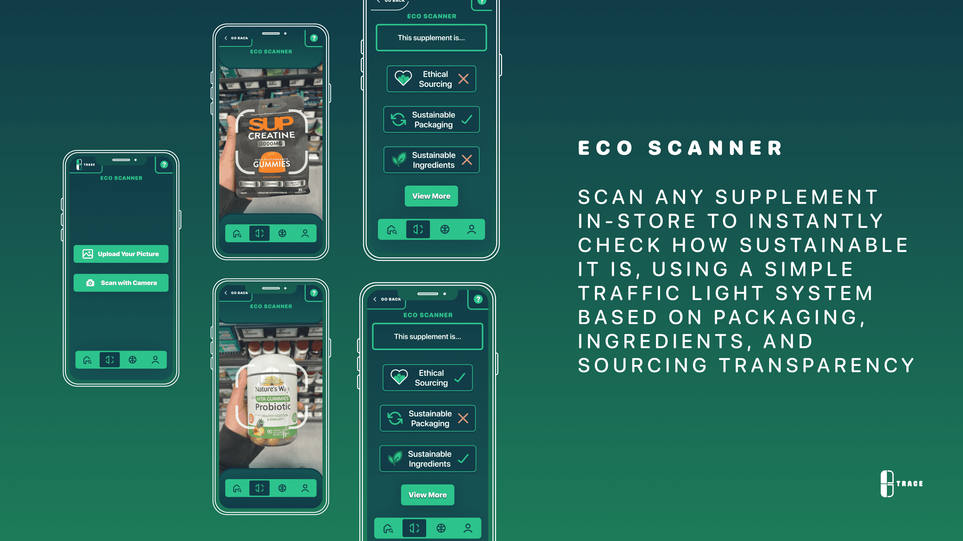
In-store scanning using AI-powered image recognition to assess sustainability at a glance
Traffic-light system translates complex sustainability data into simple, actionable feedback
Seamlessly connects physical products to digital transparency through detailed product pages
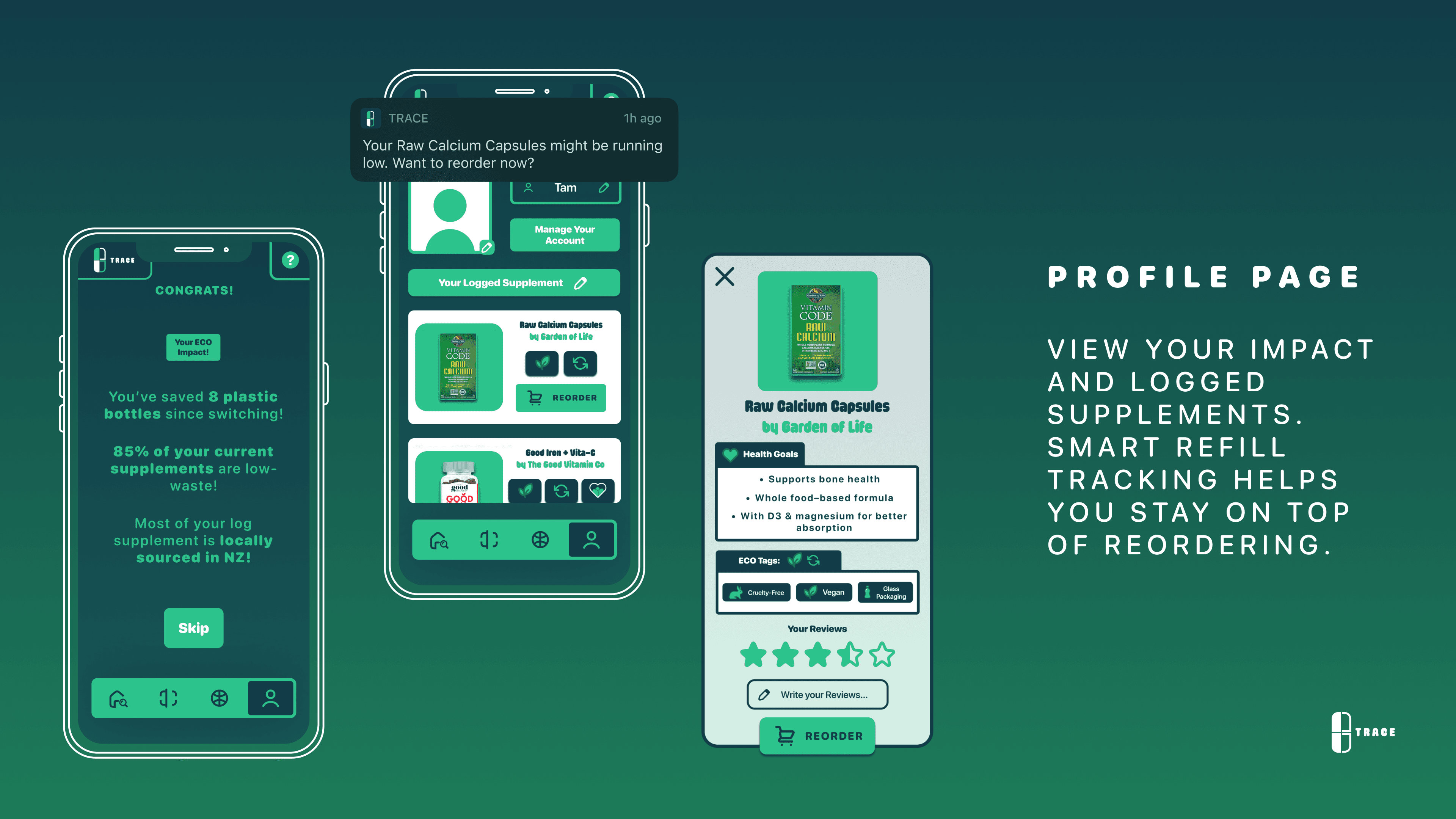
Logged supplements form a personal dashboard for tracking usage and reordering
Smart notifications support continuity by alerting users when supplies run low
Eco impact metrics visualise positive environmental contributions, reinforcing sustainable behaviour

DESIGN PROCESS
{3}
Mentored by Kate Gavin (Thoughtfull’s Lead Designer)
Conducted within an industry–academic collaboration.
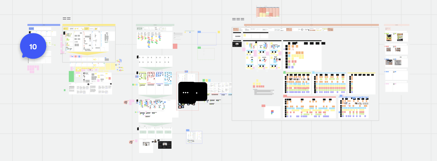
Miro Board used for team research. The project involved close collaboration with mentors and regular critique sessions that simulated a professional product team workflow.
Here’s the link to my own documentation of the process.
6 - Weeks translating ideas into functional design
Concept testing
Coding tests result
Developing idea & Design systems
Delivered
USER PERSONA
{4}
A values-driven consumer seeking trustworthy, sustainable health choices.
Goals
Sustainable supplement choices
Understand sourcing, ingredients, and packaging at a glance
Maintain consistent supplement habits
Pain Points
Greenwashing and vague sustainability claims
Difficulty comparing products across brands
Forgetting to reorder or running out of supplements
Design Needs
Clear sustainability indicators and filtering
Easy comparison and in-store verification
Simple tracking, reminders, and impact feedback



DESIGN SYSTEM
FINAL DESIGN
REFLECTION
{end}
This is the first UX project I worked on outside the academic space, closer to a real industry workflow. I learned a lot of human-centered research methods here: scoping trends from wide to specific, affinity clustering, writing a proper discussion guide, forming better design systems and presenting and iterating on design ideas with a real client and mentor.
Here’s the link to my own documentation of the process, showing the reflections I made from week 1 to the last.
Key highlights are the collaboration with my mentor, Kate Gavin. Her feedback pushed me to pivot TRACE from a physical packaging concept to a digital-first solution, quite late in the process. It was frustrating at the time, but it taught me that a good idea still needs to be usable, and storytelling can’t come at the cost of clarity.
The pivot also meant I had to move fast, which caused some scope creep. Features like the community hub ended up cut because they added noise instead of trust. That was a good lesson in knowing what to leave out, not just what to add.
On the practical side, my Figma skills grew a lot. Variables, auto-layout, and grids that used to slow me down now feel second nature. Prototyping felt efficient instead of a struggle.
The biggest growth wasn’t the tool, though. It was confidence. I started this project feeling insecure working in a group setting. By the end, I was communicating ideas clearly and pushing back when needed. That shift matters more to me than any single feature I shipped.